 Français
 English
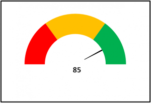
Meter chart are interesting in order to check that the indicator is in the good zone (green).
The following picture shows you what you will be able to do after reading this tuorial.
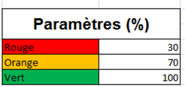
First step: Prepare data
- Fill parameters to define green, orange and red areas
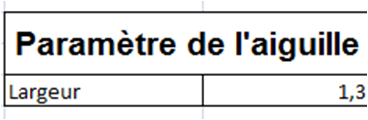
- Fill parameters to define the hand (width) of the meter
- Create the following calculations in order to create the little circle and the big circle.

Second step: Create the doughnut chart
- Select the data from the previous table that contians data about the little and the big doughnut
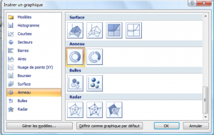
- Then click on “Insert a new chart”
- Select “Doughnut” as per the following screenshot and click on OK.
Third step: Modify the colors
Now, you only have to modify the colors of the different parts of the doughnuts according to your subject.
Have fun with this chart.
Recent Comments