 Français
 English
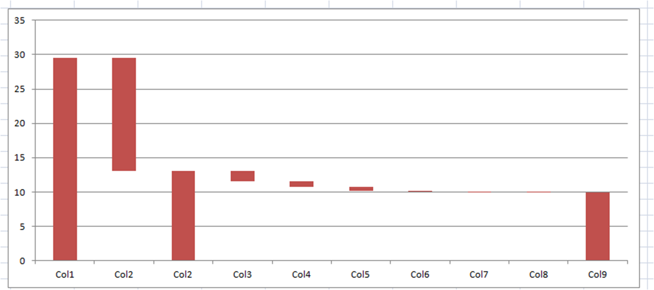
Waterfall Charts are very useful in order to represent a data breakdown with different categories.
At the end of this tutorial, you will be able to do the following chart:
First step: Parameters
The idea is to build an histogram. Thus, we need to separate data by columns and by two lines: what will be colored, what will be transparent.
We need the following data:
![]()
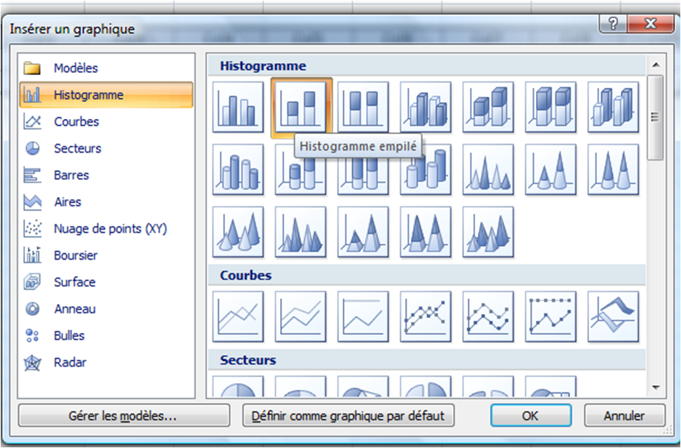
Second step: Create a chart
Now, we have to create a chart based on the previous table. To do so, select the previous table and click on “Insert a new chart” and select “Histogram”.
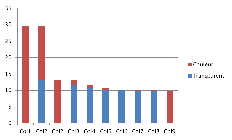
We obtain the following graph. Now, we have to change the colors of the blue columns and make them transparent.
Third step: Modify the color
To make the blue columns transparent, select the blue serie of data. Then click on fill with color and select “No color”.
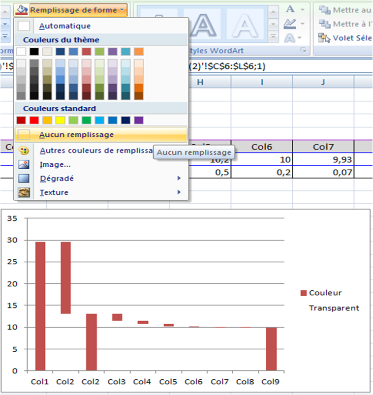
And here is the result!
Have fun with this chart. As usual, you will find the Excel file at the bottom of this page.
Recent Comments